Showing posts with label design. Show all posts

9.15.2011

a love affair - part two


We definitely wanted our invitations to be a collaboration between the two of us. We started by discussing ideas over beers (as most of our plans usually start), and eventually strayed from over-the-top-hand-made-custom-everything elaborate invitations to something that would suit ourselves and our wedding a whole lot more. Between his drawing and screenprinting skills, my digital design skills, and our mutual fondness for clean lines and simple shapes, we came up with the design for these.

Then came a whole lotta sketching, scanning, kerning, tweaking, cutting, scoring, folding, sealing, spray-glueing. 

The overall process looked a lot like these pages from Adrian Tomine's Scenes from an Impending Marriage – a highly recommended, relatable read for any (previous) bride (or bride-to-be!).  

11.24.2010

a (fake) wedding!

To go along with the my recent (real) engagement - :) - I decided to design and print some wedding invitations for a (fake) couple for my latest school assignment. The invites are hand silk-screened on to a collection of vintage handkerchiefs, the RSVP cards are on wooden postcards. That's my man and me stepping in for Amelia & Oliver in the photo booth on the front of the directions. I'm really happy the way these turned out and this has been one of my favourite projects so far this term in school. I've got a couple wedding invites to design and print in the next few months and this was the perfect practice.


4.19.2010

hausaufgabe {homework}

here are a few more of my design projects from this term. some of this will be up at Red River College for an Open House, which is open to the public on Friday, May 7 during the day and evening. There will be work from first, second and third year graphic design displayed in the Princess Street campus atrium. check it.

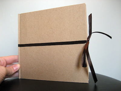
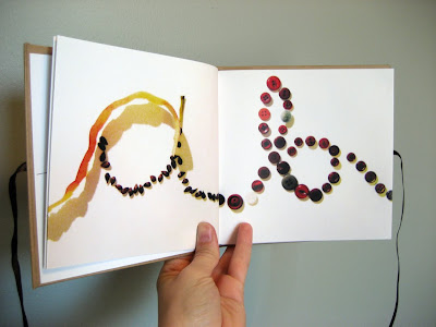
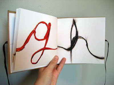
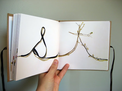
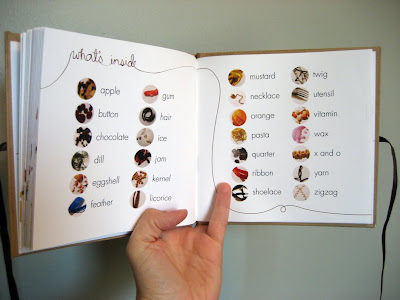
alphabet book (hand bound) :


wasabi menu redesign (hand bound) :


this menu design was based on the following principles:

Wabi-sabi represents a comprehensive Japanese world view or aethetic centered on the acceptance of transience. The phrase comes from the two words wabi and sabi. The aesthetic is sometimes described as one of beauty that is "imperfect, impermanent, and incomplete".

Characteristics of the wabi-sabi aesthetic include asymmetry, asperity, simplicity, modesty, intimacy, and the suggestion of natural processes.


album redesign :
(see the original here)


and some studies from my drawing class:

head and hands


4.10.2010

nearing the close

i'm nearly (!!) done Year One of graphic design at red river college. it's going to be a long month, but then...well, i'm not sure what then. i assume i'll go mad with sudden 24/7 free time, so i'll fill my plate with money-making, book-buying, cookie-baking and dock-lying. for now, it's work, work, work til the bitter end.

here are just a couple of my latest school projects (more to come). you can also see them, and more of my work, by following the "portfolio" link to the right. -------->

Simple Pleasures baked cookie bar, package redesign:
(click to view a larger version. see the original here )


Four Seasons vector posters (titles in german)


1.25.2010

something new.

i'm back on the blog!

this is a book/ mini portfolio of my work circa 2008.
it's all i have to post for now but it's a start.
(hopefully) more to come.